Table of Contents
Have you ever looked at a crypto chart and wondered how other people seem to understand it like it’s a simple map, while you’re staring at it like it’s a secret code? That feeling is normal because crypto charts move fast, they never close, and they can look noisy if nobody explains what you’re actually supposed to look for first.
Every day, billions of dollars’ worth of crypto change hands across exchanges, and the chart is a clean record of the battle between buyers who want the price higher and sellers who wish to sell it lower.
When you learn chart reading, you are not learning “how to predict,” you are learning how to read what the market is doing right now, so you can make calm choices instead of emotional ones.
In this guide, I’ll teach you the exact order to follow so you always know what to check first, what to confirm next, and what to avoid so you don’t fall for fake signals.
What Is A Crypto Chart?
The crypto chart is simply a visual representation of data that can help you better understand the movement of cryptocurrency prices.
As trends emerge, patterns in the data can help you see how the market is moving – whether it is bullish (people are buying and prices are rising) or bearish (price is falling and people are selling). As a result of this, it is hoped that you will be able to predict the market’s future direction and price, and thus know when to buy, sell, and hold.
Why Does Reading Crypto Charts Matter?
Crypto charts matter because they turn messy price movement into a story you can actually follow, especially when the market feels emotional and headlines are confusing.
Instead of making decisions based on fear, excitement, or what someone posted online, you can use the chart to see whether the price is rising steadily, falling steadily, or bouncing around in a tight area with no clear direction.
Charts also help you plan your trade like a student solving math step by step, because you can identify where buyers usually step in, where sellers usually push back, and where a move is strong enough to trust. When you learn charts, you stop “chasing,” and you start “choosing,” which is the difference between gambling and trading.
Ways To Read Crypto Charts
In the world of price charting, line charts and candlestick charts are the two most common formats.
1. Line Charts
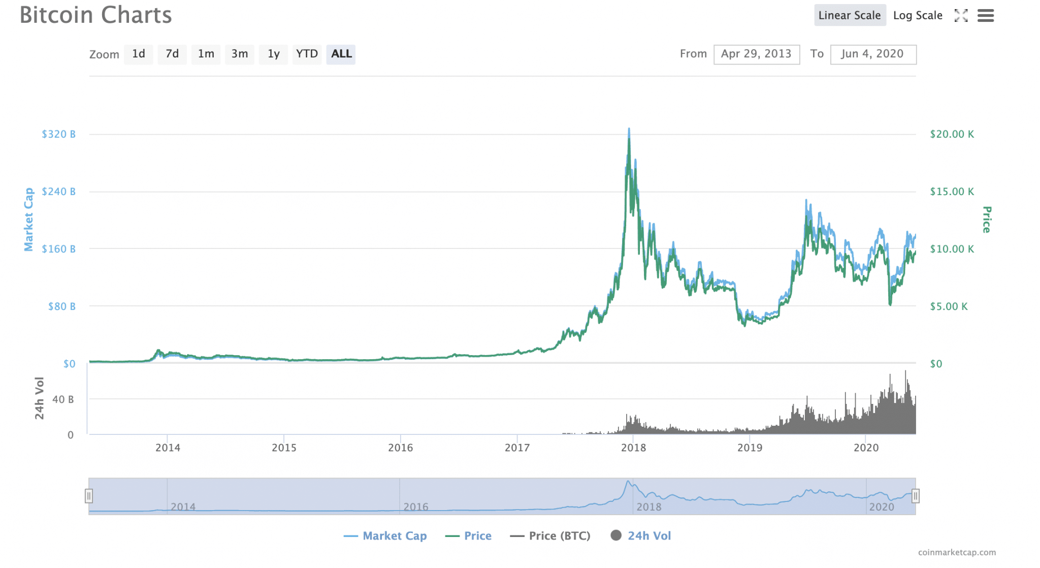
A Linear Chart
In terms of cryptographic charts, line charts are the most basic. An asset’s historical price points can be seen on a line chart. To see it in action, look at the graph above. Here, the price of Bitcoin (BTC) is represented by the right-hand scale in US dollars (though it can display any local currency). Cryptocurrencies typically have daily closing prices based on a specific period.
Chart viewing time frames can be set to any desired length, be it minutes, hours, days, weeks, months, or even years in the future. Minutes and hours tend to be the preferred time frames for experienced traders. If you’re a long-term investor, monthly is the best option for you.
Line charts are available in two different scales: linear and logarithmic, which you should keep in mind when interpreting them. Toggling between them makes it simple to do so (top right-hand corner of the graph above, but this will vary).
As the name suggests, a linear chart divides the price scale into equal segments. Using a log chart, the price of a cryptocurrency is scaled based on percentage changes, so if two price changes are different in absolute value but equal in percentage, they will both be represented by the same vertical shift on the graph. It is possible to use both charts.
The speed of price changes can be better assessed using a linear chart, whereas trends can be more easily identified using a log chart.
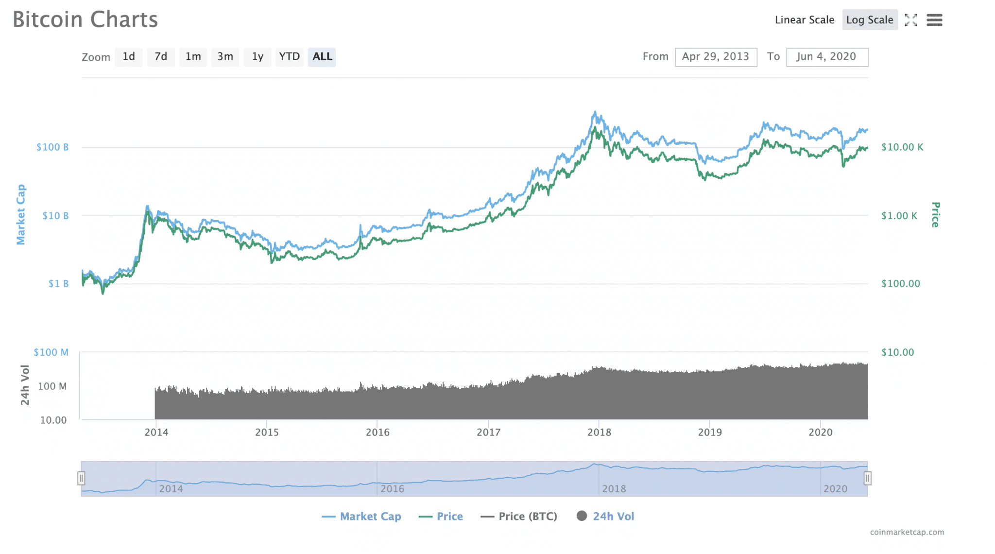
A Logarithmic Line Chart
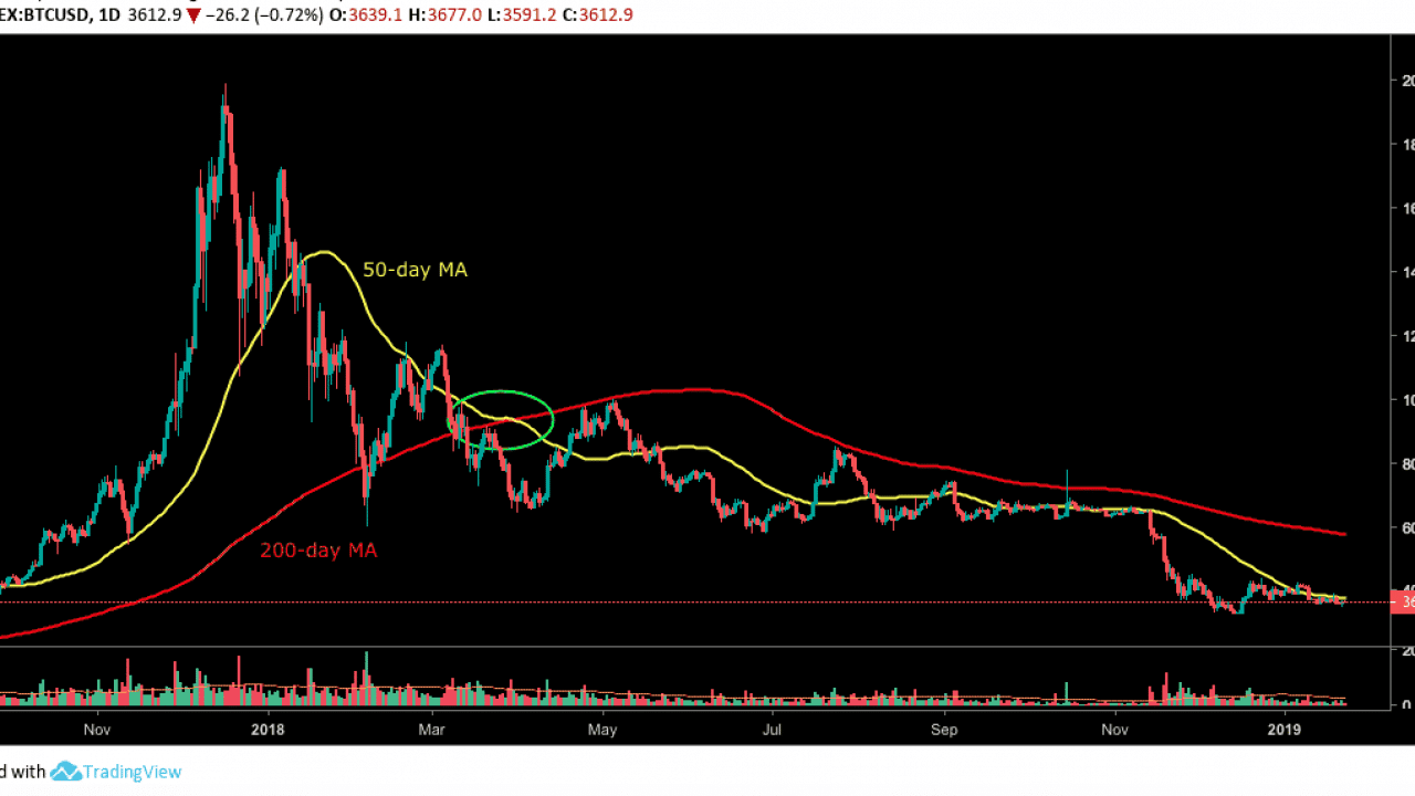
The market capitalization of Bitcoin is represented by an axis on the chart’s left side. The blue line illustrates this. The market cap of Bitcoin is simply the total value of all the Bitcoin that has been issued. The total number of Bitcoins in circulation is multiplied by the Bitcoin price to get the value. In other words, it’s a good indication of how investors currently view Bitcoin.
A black line at the bottom of the chart indicates the volume of trading over the previous 24 hours. To gauge whether or not a rise in prices can be sustained, it is useful to look at this. This means that a surge outbreak built on weaker foundations will be more likely to collapse straight back down if the volume is low.
In the meantime, higher volume increases the likelihood that an upward price swing has some real momentum.
2. Candlestick Chart
Additional information can be found in the candlestick chart, which is a more advanced trading tool. As a tool for technical analysis, it is widely used by cryptocurrency traders.
As intimidating as candlestick charts appear at first, understanding them is simple once you get the hang of it. The time is plotted on the x-axis, while the price is plotted on the y-axis. That’s a lot like the line chart, right? Candlesticks are a big difference.
The term “candlestick” refers to the shape of each candlestick on the graph. Red (or pink) or green rectangles with a line coming out of the top or bottom like a candle’s wick. The wick, the length of the candlestick, and the color of the flame all reveal information about the candle.
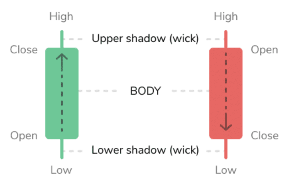
An opening-to-closing balance discrepancy for that coin is shown by a rectangle in the chart. When a cryptocurrency has green candlesticks, it indicates a rise in value, which means that both the opening and closing prices are at their highest points.
The opening price is at the top, and the closing price is at the bottom, as indicated by red (or pink) candlesticks. As a result, you may occasionally see symbols that appear to be crosses or even plus signs. For traders, this is what is known as a doji, which means the day’s opening and closing prices were the same.
The “wicks,” on the other hand, emerge from the rectangle from either the top or bottom of the rectangle. These represent the day’s highest and lowest price points. The more volatile the market, the more likely it is that your coin’s gains or losses of the day will continue or be reversed on the next trading day, according to technical analysis proponents.
As a result, it reveals whether or not the market is expanding downwards more quickly than it is expanding upwards.
Imagine a situation in which the wick at the top of the candle is extremely short. Considering the coin’s closing price was near its day’s high, this suggests it is doing well. An indicator of how much people were willing to pay for the coin would be a long, drooping wick at the top of the coin’s value. Thus, a decline or a shift to the bearish side of the market is in the offing.
To put it another way, investors want to buy a cryptocurrency when it is at its lowest possible price, which they believe to be right now. As a result, there could be future upward trends.
If the wick is long at the bottom of a candle, it indicates that the coin is still being sold. As a result of the increase in supply, the price is likely to fall even further. That being said, an extended candlestick indicates that the coin’s value has already dropped and buyers are eager to get their hands on it while it is at its lowest point. This could lead to a rise in the following day’s prices.
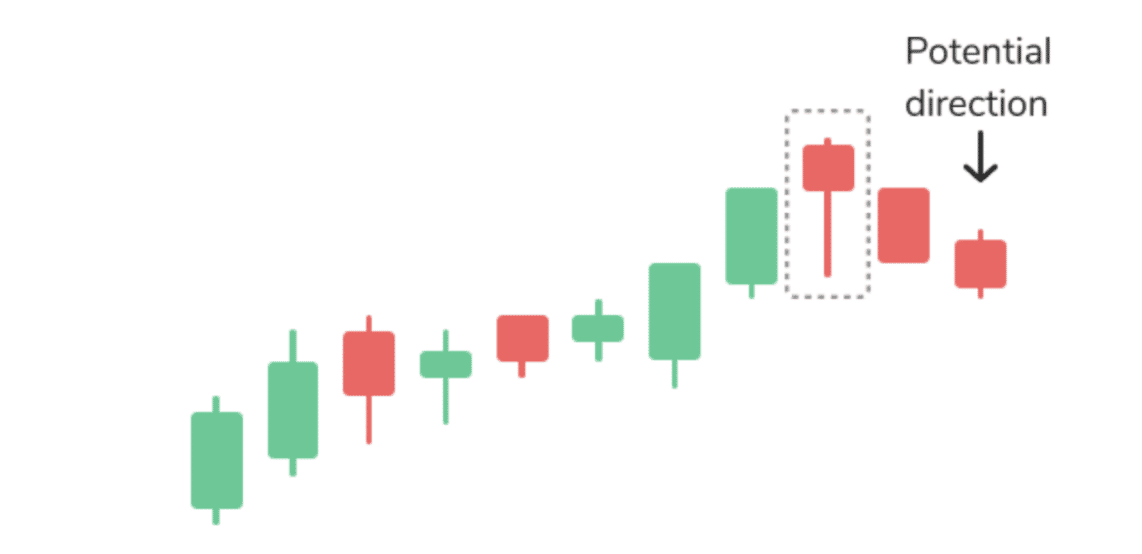
The hanging man is an example of a bearish candlestick pattern. When the upward trend ends, the closing price is lower than the opening price, which is similar to a hammer formation.
3. Moving Averages
Moving average indicators are another common line you will see on cryptocurrency charts. Coin closing prices over the specified period are used to calculate these lines. An excellent tool for spotting trends, this indicator can also be used to help identify signals for entering and exiting positions.
A 50-day moving average is calculated by summing the closing prices of a coin over the previous 50 trading days and dividing it by 50.
Popular Crypto Chart Patterns
Patterns are useful because markets repeat human behavior, and human behavior tends to form similar shapes on charts when buyers and sellers make the same types of decisions under pressure.
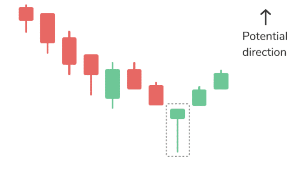
1. Head & Shoulders
Head and shoulders often show up when an uptrend is getting tired, because buyers push up, pull back, push up even higher, pull back again, and then fail on the next attempt, which signals that strength is fading. Traders watch the breakdown below the support line (the neckline) to confirm the reversal, and volume is your truth check, because a heavy-volume breakdown is more believable.
2. Triangles
Triangles form when price starts moving in a tighter range, which usually means the market is building pressure and preparing for a stronger move. Ascending triangles suggest buyers are pressing upward into resistance, descending triangles suggest sellers are leaning on support, and symmetrical triangles suggest pure compression where either side can win.
You confirm the breakout with volume, because volume often spikes when the move becomes real.
3. Double Tops & Bottoms
Double tops and double bottoms are powerful because they show the market failing twice at the same zone, which often means the current trend is losing energy. A double top happens when the price hits resistance, pulls back, returns, and fails again, which suggests sellers are defending that level, while a double bottom shows buyers defending support twice.
These patterns get stronger when the second reaction comes with clear volume.
Mistakes to Avoid While Reading Crypto Charts
1. Overtrading
Overtrading happens when you treat every small price move like an opportunity, so you jump in and out without a plan, and that usually leads to weak entries and fast losses. A smarter approach is to wait for structure, meaning you want a clear trend or range, a clear support or resistance area, and volume that supports your idea. The market will always offer another setup, but your capital doesn’t always recover from rushed decisions.
2. Ignoring Volume
Ignoring volume is like judging a fight by looking at the scoreboard but refusing to watch the punches, because volume shows whether traders truly backed the move. Price can pop above resistance and look exciting, but if volume is low, the breakout may be fragile and price can fall back quickly, trapping impatient buyers. When you check volume every time, you filter out many fake moves and you make decisions with evidence instead of hope.
3. Missing Candlesticks
Candlesticks become risky when you read them alone, because one candle can look dramatic while the bigger picture tells a completely different story. A long wick might look like a reversal, but if the trend is strong and volume supports continuation, it may just be a normal pullback, not a real shift. The smarter move is to read candles in groups, compare them to key levels, and confirm the story with volume.
4. Dependence on Indicators
Relying on indicators alone often leads to late entries and late exits, because many indicators react after the price has already moved, which can make you buy after the pump or sell after the drop. Indicators should support your chart reading, not replace it, so you first read trend direction, mark support and resistance, and check volume behavior, and only then use RSI, MACD, or moving averages to confirm your idea. That habit keeps you calm and consistent.
5. Ignoring the Market Conditions
Charts show what price has been doing, but market conditions explain why price can suddenly behave differently, especially during big news, regulation updates, liquidations, or major macro events. A setup can look perfect and still fail if the market gets shocked, which is why smart traders stay aware of the environment around the chart. You’re not trying to predict news, but you are trying to avoid trading blindly during high-risk moments when patterns break easily.
Tools & Platforms for Reading Crypto Charts
1. TradingView
TradingView is one of the best charting tools for beginners because it gives you clean charts, easy drawing tools, and a huge library of indicators that help you practice without feeling lost. You can switch timeframes smoothly, mark support and resistance zones, draw trendlines, and set alerts that notify you when the price hits key areas, which reduces the urge to stare at the screen all day. It’s a strong all-in-one learning platform.
2. Binance
Binance is popular because it combines charting and trading in one place, so you can study the setup and place a trade without switching platforms. Its advanced charts let you apply indicators, use multiple timeframes, and track real-time volume, which is useful if you like fast feedback. If you’re learning, treat it like a practice space first, meaning you focus on reading trends and levels before risking serious money, because tools don’t replace discipline.
3. Coinigy
Coinigy is useful if you track multiple exchanges, because it lets you monitor different markets in one dashboard, which reduces confusion when prices vary slightly across platforms. This matters because crypto liquidity is spread out, so serious traders often compare price and volume behavior across exchanges to confirm whether a move is real or isolated. Coinigy also supports alerts and technical tools, which help you stay organized if you watch many coins and want a routine.
4. Crypto.com
Crypto.com is built for mobile-first trading, which makes it helpful when you want to check charts, apply basic indicators, and act quickly while on the move. Its charts are simpler than pro platforms, but that simplicity can be a good thing for beginners because it reduces the temptation to overload your screen with tools you don’t understand yet. The smart approach is to keep it basic: trend, levels, volume, then confirmation.
Frequently Asked Questions (FAQs) About Reading Cryptocurrency Charts
1. What does 100x mean in crypto?
100x means you’re using leverage to control a position that’s 100 times larger than your own money, so even a tiny price move can multiply your profit or your loss fast. Because liquidation can happen in seconds, beginners should avoid 100x until risk control and chart confirmation feel automatic.
2. What is the value of $100 in crypto?
$100 in crypto means you’re buying $100 worth of a coin at the current price, so the amount of crypto you receive depends on that coin’s price at the moment you buy. The value can rise or fall immediately after purchase because crypto prices change constantly.
3. How do I know that the crypto markets are about to go up or down?
You can’t know for sure, because markets react to emotion, liquidity, and unexpected news, so certainty is a trap. What charts can give you is probability, especially when trend direction, support/resistance, and volume all agree.
4. How can I analyze cryptocurrencies using a graph?
Start by choosing a timeframe that fits your goal, then read the trend, mark support and resistance, and confirm moves with volume before adding indicators. Indicators like RSI or moving averages should only confirm what price is already showing you, not make the decision for you.
Conclusion
Cryptocurrency charts are not scary once you learn what to look for first, because chart reading is really just a clean way of understanding market behavior without listening to noise.
When you follow a step-by-step routine, timeframe first, chart type second, price action next, volume confirmation after, then structure with trendlines and support zones, you stop guessing and start making calm decisions. Indicators and patterns then become useful tools instead of confusing decorations.
The more you practice reading charts like a routine, the more confident you become, because you start recognizing the same behaviors repeating, and that’s when trading begins to feel structured, not random.
Last updated on January 13, 2026